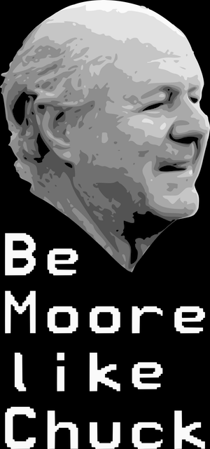
Be Moore Like Chuck
Not too long ago, (*cough* over 2 years ago at this point) Phil and I were chatting about some projects, Forth, and simplicity when “Be Moore Like Chuck” appeared in my buffer. Liking nothing more than t-shirts and bad puns, I simply couldn’t resist the urge to, well, make a t-shirt out of this bad pun.
There’s of course more to it than that. The phrase “Be Moore Like Chuck” pays homage to Forth’s creator, Charles H. Moore, a man with nothing short of an exquisite resume. What’s so special about Chuck? Well, there’s Forth; multiple versions of Forth. There’s multiple microchips, various companies, contributions to NASA and science generally, and a number of other accomplishments that I have only imagined.
Being more like Chuck isn’t about being successful in the computing industry. No, it’s about eschewing complexity in favor of simplicity and of efficiency. In favor of rapid, incremental development. It’s about being brave enough to simplify our specifications of software to a managable level of complexity. It’s about building a new language (bottom up programming) for every task; one that is specifically designed for the task at hand. It’s about challenging the status quo in computing and letting your work talk for you.
We should all strive to do that more. We should all strive to “Be Moore Like Chuck.”
So, anyway, I immediately had an idea for the t-shirt, and Phil suggested what I was thinking; the text must be in the font face used by colorForth. I couldn’t agree Moore, and so I got to work. Not surprisingly, colorForth’s font isn’t widely available in True Type, open type, or any of the other less modern font formats. That left screenshots of colorForth, or gasp booting up colorForth.
But what good would the story be if I had just done that? Instead of
taking the easy way out, I instead went down the rabbit hole of trying
to understand the assembler code for colorForth’s font
rendering. Files were named appropriately. And while I didn’t exactly
understand what was going on, I got enough clues to draw a hypothesis
about the file icons.fnt which seemed the most probable place for
font data to be stored.
A quick run of file(1) suggested it was just pure data, which ruled
out it being an actual font; I suspected a cousin of
the
Bitmap Distribution Format,
for instance, but at exactly 6KB, and with no discernable ASCII
characters present, it was obviously not that simple.
Knowing about how BDF stores the pixel information for characters
turned out to be incredibly useful, as icons.fnt stored 2
bytes per row for each character. Since the assembly clued me into
glyphs that were 16x24 pixels in size, and 6KB / 48B gives me exactly
128 characters, I was pretty sure I was on the right track.
Testing my assumption gave me…nothing. The first 48 bytes were
blank. But when I displayed the next 48 bytes using Python’s bin
function, and padding with leading 0s, I knew for sure that I was right,
as I was greeted with an ‘r’. That didn’t really make sense to me
though. Why would the second character be an ‘r’?
A couple of lines of Python, a little bit of playing in the REPL, and suddenly I had a quick and dirty script that could generate this sprite sheet:
From here, I could simply extract the necessary characters to “Be Moore Like Chuck” and, as they say, Bob’s your uncle.
The problem is, I don’t exactly like t-shirts with just a silly phrase, even in the distinctive colorForth font, even as bad a pun as “Be Moore Like Chuck”. I sought after a portrait of Chuck that I might be able to turn into a one (or two) -color bitmap, but there wasn’t much in the way of choices, and absolutely none of them had decent lighting, nor sized for print.
A designer friend of mine took too long to get back to me with suggestions, and I eventually became way too antsy, so I started playing in The Gimp. I ended up doing something like the following:
- Brightness / contrast adjustment
- 3 Color Posterize
- Gaussian blur (1 or 2 pixels?)
- Sharpen to get some crisp edges.
Then in Inkscape, I traced the bitmap, and ended up with a vector that turned the 220px wide original picture into something infinitely scalable, and something that I could definitely get printed well on a t-shirt.
Before I did, however, I wanted to make sure Chuck was OK with it, and so I asked his permission to offer the shirt to anyone interested, promising to donate any “profits” to a charity of his choice.
I never expected to receive a response, but a couple of days later:
“It’s ok. I can grok being immortalized on a t-shirt.”
I’ve been wearing the result for about a year and a half now, but I’ve always considered it a v0. People who notice the shirt don’t realize that there’s a face on it, and so, I went back to the literal drawing board and made v1.
This result is something I quite like. As a result, I’ve now made it available to anyone else who interested in pledging to “Be Moore Like Chuck.” The price is “at Spreadshirt’s cost” + $5 for Chuck’s charity of choice, the MIT Department of Physics.
Epilogue
So how come colorForth stores its characters in a seamingly non-ASCII order? Well, it turns out that one of the goals of colorForth was hyper optimization, and ease of input. There’s little punctuation because color is used instead. It also has a sophisticated editor which uses only 27 of the 102 keys on a standard keyboard.
The relative frequency of characters determines the order of the characters in the sprite sheet. You see, to save space in code, and in the runtime, characters are not stored as ASCII. In place of ASCII, Huffman codes are used. The letter ‘a’ is 5, and the letter ‘b’ is 19. This is odd coming from a conventional computing background, but Forth is far from conventional. Forth is unique, to say the least.
- 2018/12/31